DEVELOPING ALTERNATIVES
Finding Meaning in the J2SR Metrics
Sep 19, 2019
How can national-level indicators be best used to inform the debate around a given country’s development challenges? It’s a question many of us are asking following the release of the Journey to Self-Reliance (J2SR) Primary Metrics—17 cross-country metrics that the U.S. Agency for International Development (USAID) has established to measure a country’s progress on economic growth, democratic governance, civil society capacity, and other aspects of development.
While USAID is still working through how these metrics will be used, its intention is to use them “to define country roadmaps”—which chart where a country stands in its journey to self-reliance and how it might get there.
National-level metrics are useful when they afford a common language for development practitioners to discuss the strengths and weaknesses of countries. They become counterproductive when overzealous conclusions are made based solely on viewing a set of country rankings, as the Agency is careful to warn against. Complementing the J2SR metrics with rigorous descriptive methods of analysis can help avoid this trap, provide potentially useful insights, and provoke new questions as to how certain policies and programs may fail or succeed in a given country.
Seeking to illuminate how we think about the data that make up country roadmaps, this article has three parts:
- An overview of the J2SR metrics, their core components, and how USAID has categorized them.
- A brief discussion of the limitations inherent in any metric-based cross-country analysis—to which J2SR is no exception—highlighting issues such as subnational variance, lack of uniformity in measurement, and the challenges of asserting external validity or assigning causality.
- Finally, five examples illustrating approaches that policy makers and development practitioners might employ to ask more refined questions of the J2SR metrics and what may or may not work on a policy or programmatic level.
Part 1: What are the Metrics?
USAID has split the 17 J2SR metrics into two categories representing the twin drivers of development: commitment and capacity (see Figure 1). Capacity is defined as the point where countries stand within “the dimensions of political, social, and economic development,” and their ability to address problems within those dimensions. Commitment is reflected in the choices a government makes, and how well formal and informal institutions, such as cultures and norms, “support progress towards self-reliance.”
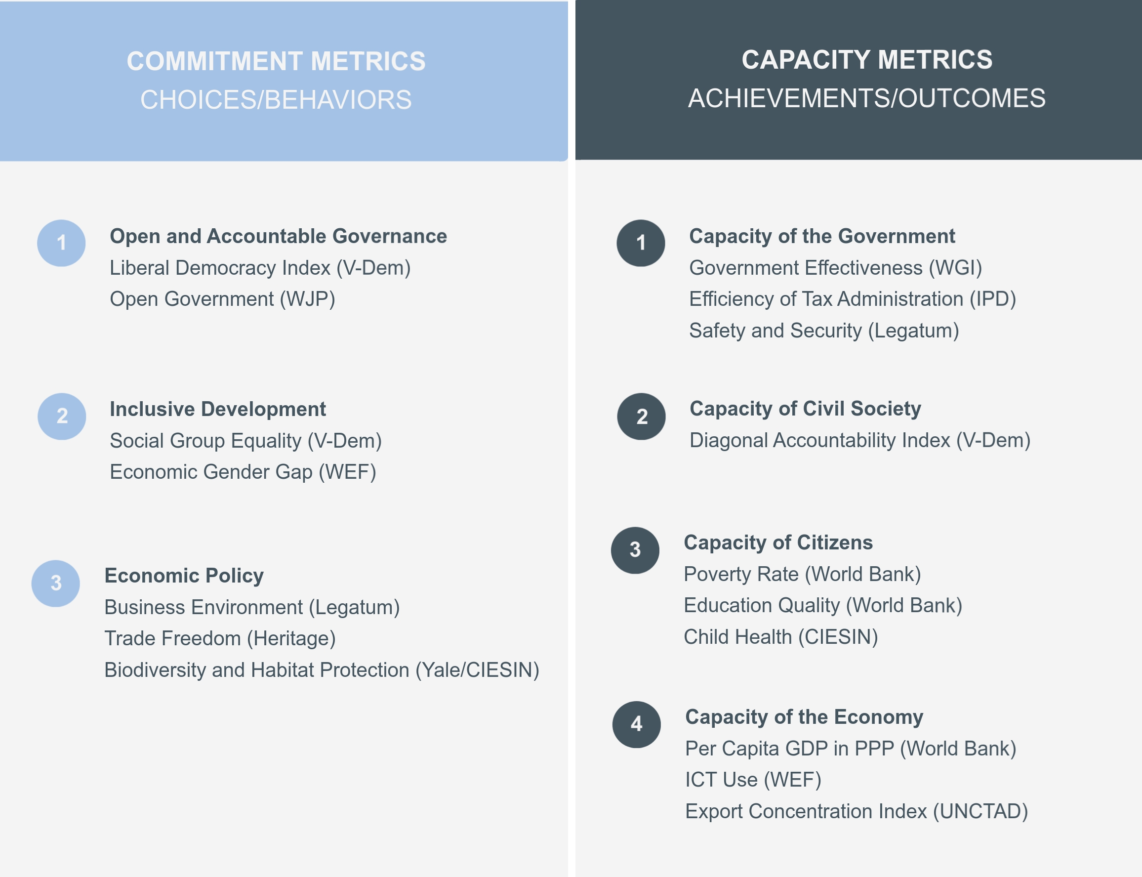
Figure 1
The methodology behind each measure varies from metric to metric. Naturally, the methodological complexity increases for metrics defined by composite indices. The Child Health metric, for example, is calculated by averaging three equally weighted subindicators developed by the United Nations (the Under-5 Mortality Rate, Access to Improved Sanitation, and Access to Improved Water). The Liberal Democracy indicator from the Varieties of Democracy Project is calculated by an aggregate formula of the liberal and electoral submetrics. 1
In general, the metrics are based on three types of sources: expert surveys, government statistics, and public opinion polls. Some bring together subindicators of different types; others utilize subindicators of only one type. For example, the Child Health metric is composed of official government statistics reported to various U.N. agencies, the Social Group Equality and Liberal Democracy metrics are based exclusively on expert surveys, and the Economic Gender Gap metric is made up of subindicators drawn from public opinion polls, expert surveys, and government data.
The degree of methodological transparency also varies. As with any indicator or index, J2SR will contain some level of measurement error and there are always questions surrounding the calculation of indices based on expert survey/rating indicators. USAID lays out the construct for most of its metrics in the Journey to Self-Reliance Methodology. Greater detail is provided on the websites of each third party from which a metric is taken, but there is significant disparity in the level of detail. For example, every step in the calculation of indicators taken from the Varieties of Democracy is broken down in their methodology, while the composition of the Trade Freedom indicator generated by the Heritage Foundation includes a non-tariff barrier score “based on qualitative and quantitative information” that is not provided.
Part 2: The Limitations of Metric-Based Cross-Country Analysis
Before finding out what the data can tell us, it’s important to remember what it can’t. There are countless examples of bad uses of metric-based comparative analysis and the best piece of advice one can give with cross-country analysis is not to get carried away with presumptuous inferences. Here are three limitations to bear in mind:
Subnational variance: Most obviously, these metrics cannot resolve questions of subnational scale. Many of the issues we’re investigating require more granular information than the metrics provide. While it may help to know what Malawi’s national poverty rate is, that data point might be misleading if your poverty reduction project or proposal is designed to operate only in the capital, Lilongwe. Such limitations are serious because many of the problems developing countries are trying to tackle occur within their own borders at the subnational level—rural districts, say, or informal settlements, or mountainous areas—and these are places broad metrics can illuminate only indirectly.
Lack of measurement uniformity: Even in cases where knowing the national poverty rate is helpful, issues of data quality apply. Several J2SR metrics, such as Child Health, Poverty Rate, and GDP per Capita, rely on data measured by national governments, which make their own subjective judgments and assumptions when doing these calculations. Questions about the reliability of these judgments linger despite international organizations’ efforts to monitor and assure data quality. In the development realm, the controversy surrounding Rwanda’s poverty data, as highlighted recently by the Financial Times, highlights some of these difficulties. But such challenges are not limited to the developing world: experts have noted inconsistencies even in some of the most established measures, such as divergence in measuring infant mortality rates in high-income countries.
External validity and causality: International development practitioners are ill-served by arguments along the lines of “policy X will work in country Y because it worked in country X” (where country X is usually South Korea or Singapore). The problems with such reasoning usually come down to questionable attribution of causality and external validity. It is exceedingly difficult to infer causality based on national-level metrics—certain policies or programs may indeed influence country indicators, but in the absence of a counterfactual there is no sure way of telling. External validity is defined as the validity of applying the conclusions of a scientific study outside the context of that study. Even if we can accurately determine through rigorous methods that a given program or policy improved some outcome or the score of a given metric, the extent to which such a result is generalizable to other contexts, time periods, and people is often unclear. The external validity problem is a common challenge for evaluators when scaling up a successful pilot or making recommendations for implementing a similar initiative in another region. Relying on national-level metrics accentuates the problem since there is no control over determining what caused what. Simply eyeballing national-level metrics and observing movement in national rankings might be a good place to start, but it is not a method for making recommendations regarding what will work in other countries.
Part 3: Five Approaches to Analysis
Caveats aside, the J2SR metrics can provide important takeaways if we approach them in the right way. Here are five suggestions for getting more out of them.
1. Grouping the Metrics Can Provide a More Comprehensive Picture
Beneath the overall J2SR concepts of Capacity and Commitment, USAID breaks its metrics into subcategories as illustrated in Figure 1. Grouping together the indicators that make up these subcategories to come up with composite scores can provide a clearer sense on where countries stand under each subcategory.
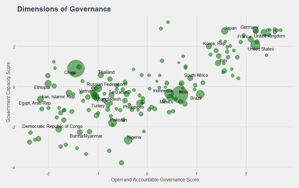
Graph 1
For example, in Graph 1 we create a new score using principal component analysis for two of the subcategories of the J2SR metrics. In this case, we combine the Liberal Democracy and Open Government metrics to create an overall “Open and Accountable Governance” score, and the Government Effectiveness, Efficiency of Tax Administration, and Safety and Security metrics to create an overall “Capacity of the Government” score.
Aggregating metrics to create new scores through averaging or more advanced methods like factor analysis is useful mainly when we have many variables that can be combined into a concept that is useful and measurable. It is perfectly reasonable to want to know what government capacity among countries looks like according to the definition of USAID, which takes into account measures related to bureaucratic effectiveness, satisfaction with public goods and services, tax administration, and state monopoly on the use of force and controlling violence. Looking at one score that incorporates these features rather than separately looking at each metric separately can give a better sense of what a country is or isn’t achieving.
2. Think less about regional comparisons than nearest neighbor matching, which yields more suitable country comparisons
Statistical matching is a commonly used method for finding or pairing a given point with another “closest” point based on a defined set of variables. Matching techniques, broadly defined, are employed in areas as diverse as DNA sequencing, classifying seizure types for people with epilepsy, and impact evaluation of international development programs.
How can such a method be useful for cross-country analysis? Let’s suppose we want to compare governance in Libya to other countries. One method is to group by region, so in this case we could select other MENA countries as points of comparison (see Graph 2). While it is sometimes appropriate to use regional groupings, often the variance within regions can be larger than selecting comparison countries at random. Nearest-neighbor matching can provide us with other countries whose scores make them more meaningful comparators to the country in question.
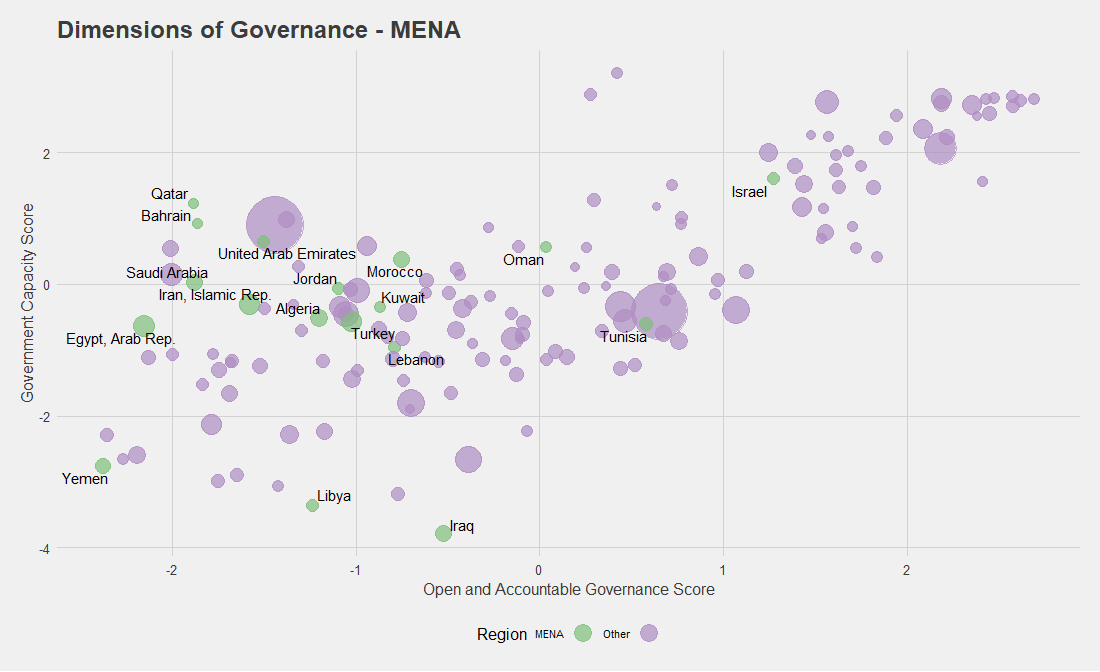
Graph 2
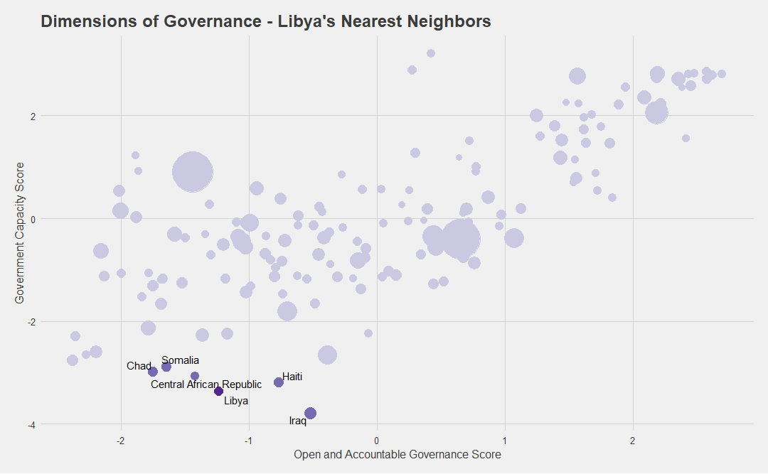
Graph 3
Graph 3 displays Libya’s five nearest neighbors based on our nearest-neighbor matching method. 2 The algorithm simply finds the five closest points in distance for the country in question. Comparing these two graphs, the takeaway is obvious: Somalia, Chad, CAR, Haiti, and Iraq share more common governance challenges with Libya than Egypt, Morocco, Lebanon, and many other MENA countries. Knowing which countries have more in common with Libya will serve as a more reliable starting point for deeper analysis on these issues, which in turn should encourage examining the development of these countries together.
This method will not always work. Often, the scores we are using do not tell us much about the underlying structure of countries. With regard to governance, for example, we might be comparing constitutional monarchies with republics, presidential systems with parliamentary ones, one-party electoral systems with multi-party systems, and so on. Sometimes, countries make for poor comparisons for reasons not directly related to the metrics at hand. For example, Brazil and Trinidad and Tobago have enormous differences in population size—among other things—which may render moot their similar scores for governance metrics. Nevertheless, since such differences also exist among countries in regional groupings, using nearest-neighbor matching at least avoids the false sense of an apples-to-apples comparison.
3. Measure percentage change with nearest-neighbor matching to establish the right baseline
Many examples of misleading analysis and bad inferences rest on the use of percentage change. Typically, some metric such as “GDP growth” or “improvement in PISA test scores” is shown in a chart to leave viewers with the wrong impression on where things are going for the countries in question, suggesting that developing country X is the land of economic opportunity while the Netherlands is in economic ruin, or something to that effect.
One problem associated with percentage change data is that countries never start at the same baseline. Many of the highly rated countries cannot show great improvement across a five- or 10-year horizon because there is nowhere for them to go. Further, many of these snapshots don’t indicate behavior prior to the baseline year: if a country suffered political turmoil or an economic downturn right before the base year, it will likely regress to the mean soon thereafter.
Graph 4
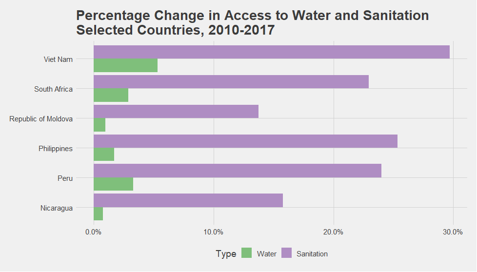
Figure 2
One way to avoid this pitfall is to find comparable countries at the baseline—through nearest-neighbor matching or other methods—and then measure the change. In doing so, we ensure that we’re not comparing apples to oranges.
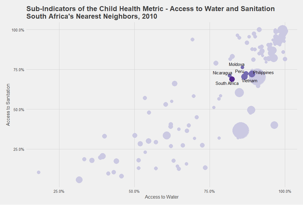
Say we’re interested in South Africa’s progress in advancing child health over the past decade. First we control for South Africa’s nearest neighbors at the baseline to find which other countries had comparable water and sanitation access numbers in 2010 (Graph 4). Then, we visualize the seven-year percentage change among the selected countries to see what progress has been made by South Africa alongside its nearest neighbors (Figure 2).
Nowhere is it suggested that South Africa must model itself after Vietnam or Peru simply because their increases in access to water and sanitation over the seven-year period are higher. Rather, this exercise invites us to consider a range of other questions: What were the main WASH policies in these countries over the past seven years? For what subnational regions and for what income groups did these countries improve access? What do the evaluations and other forms of robust evidence on WASH interventions, policies, and programs in these countries tell us? Can successful policies and interventions identified in one country be implemented in the other countries or in different contexts?
The answers to these questions do not lie in the metrics. We’ll need to examine other sources of information to find what we need. But looked at in the right way, the J2SR metrics can help us think deeper about how our country of interest has progressed relative to similar cases.
4. Consider disaggregation to understand what is driving trends
In the same way we can group together metrics to measure some larger construct based on multiple variables, we can also break down the J2SR metrics in some cases to examine their subindicators. Drilling down can be particularly useful when we’re looking for insights into what might be driving a trend over time.
Graph 5
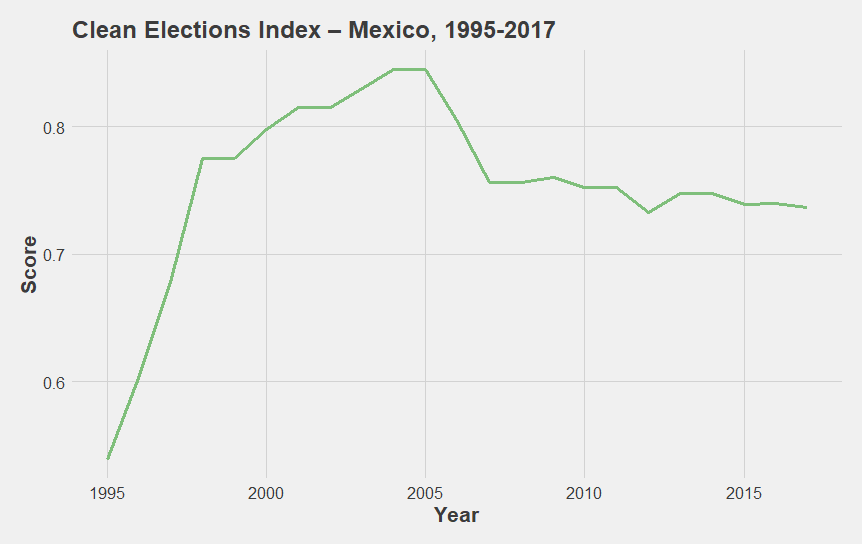
Metrics from the Varieties of Democracy Project are a great example because many of them have multiple levels and subindices. Graph 5, the Clean Elections index, which is a component of the J2SR’s Liberal Democracy metric, shows an initially sharp and then gradual decline for Mexico starting in 2005. Prior to 2005, we see a sharp increase, beginning in the mid-1990s.
Graph 6
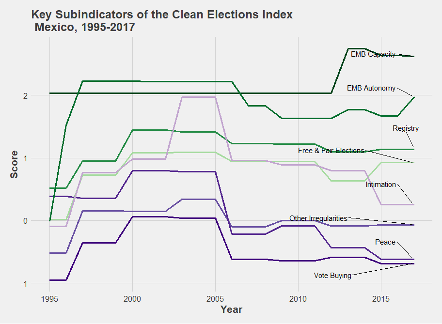
What contributed to this sharp increase and sudden decline? The subindicators shown in graph 6 provide information on the principal components of clean elections in Mexico. They suggest that the increase in the mid-1990s was heavily driven by the Elections Monitoring Board Autonomy score, as the administration of national elections became progressively impartial and removed from the incumbent government. Meanwhile, the decline starting in 2005 has mostly been driven by reductions in the Intimidation, Vote Buying, and Peace subindicator scores, thereby suggesting increased levels of repression against opposition candidates, use of money or gifts to buy votes, and greater levels of violence between civilians during the election periods. In the most recent elections, these problems have largely offset minor improvements in the EMB Capacity and EMB Autonomy scores.
Any elections-focused program in Mexico would do well to look below the surface of the Liberal Democracy metric.
5. Include the “developed” countries to provide context
All third-party sources used in the J2SR metrics contain data on high-income countries. It would be unnecessarily reductive and limiting to cut them out of the analysis. Many low- to middle-income countries face problems in specific areas but excel in others; one of the virtues of country-level indices and metrics is that they point to the many facets that contribute to a country’s economic growth, state capacity, environmental commitment, and other topics crucial to development—and they remind us that the learning between developed and developing countries can and should go both ways.
Top Countries in Economic Gender Gap, 2018
| Rank | Country Name | Score |
|---|---|---|
| 1 | Lao PDR | 0.95 |
| 2 | Barbados | 0.87 1 |
| 3 | Bahamas, The | 0.863 |
| 4 | Benin | 0.850 |
| 5 | Burundi | 0.839 |
| 6 | Belarus | 0.838 |
| 7 | Guinea | 0.820 |
| 8 | Cameroon | 0.816 |
| 9 | Sweden | 0.808 |
| 10 | Latvia | 0.807 |
| 11 | Norway | 0.806 |
| 12 | Namibia | 0.804 |
| 13 | Botswana | 0.802 |
| 14 | Philippines | 0.801 |
| 15 | Slovenia | 0.795 |
| 16 | Iceland | 0.793 |
| 17 | Finland | 0.786 |
| 18 | Moldova | 0.875 |
| 19 | United States | 0.782 |
| 20 | Mongolia | 0.780 |
Figure 3
Top Countries in Social Group Equality, 2017
| Rank | Country | Score |
|---|---|---|
| 1 | Norway | 2.842931 |
| 2 | Luxembourg | 2.812965 |
| 3 | Germany | 2.623542 |
| 4 | Vanuatu | 2.585769 |
| 5 | Mongolia | 2.574794 |
| 6 | Denmark | 2.541700 |
| 7 | The Gambia | 2.496522 |
| 8 | Uruguay | 2.481603 |
| 9 | Austria | 2.454881 |
| 10 | Poland | 2.429505 |
| 11 | Switzerland | 2.330448 |
| 12 | Tunisia | 2.330208 |
| 13 | Sweden | 23320710 |
| 14 | Portugal | 2.307374 |
| 15 | Niger | 2.273868 |
| 16 | Greece | 2.273868 |
| 17 | Belgium | 2.244480 |
| 18 | Senegal | 2.241086 |
| 19 | Costa Rica | 2.239165 |
| 20 | Italy | 2.237418 |
Consider, for example, Figure 3. Countries in the top 20 of the Economic Gender Gap metric include Laos, Moldova, Cameroon, and several other low- to middle-income countries. Similarly, Vanuatu, Mongolia, Senegal, Niger, and the Gambia all have scores in the Social Group Equality metric comparable to Germany, Norway, and Austria. Doesn’t that seem like useful information? Are we certain all development experts are aware of it?
Conclusion
National-level metrics such as the J2SR say little about reality at a granular level, numbers on their own do not imply uniform measurement, and almost no approach will definitively say whether one’s preferred policies and programs will work in one country just because they seemingly did in another. But the J2SR metrics certainly have value. In most cases, the approaches highlighted here as productive ways of looking at the J2SR will serve only as a starting point for defining country roadmaps. Grouping metrics to measure subcategories, looking at disaggregates to find what drives certain trends, and identifying nearest neighbors will help us think more carefully about our comparative analysis. Employing these techniques will also, I hope, prompt us to ask new questions and lead us to consider additional information from complementary sources as we think about how to design, measure, and implement the initiatives associated with country roadmaps.
Footnotes
-
The formula is as follows: v2x_libdem = .25 ∗ v2x_polyarchy1.585 + .25 ∗ v2x_liberal + .5 ∗ v2x_polyarchy1.585 ∗ v2x_liberal. ↩
-
There are many methods to derive nearest-neighbor matching. Given the simplicity of our dataset, a linear similarity search based on the Euclidean distance is calculated. This methodology is outlined in the link provided as well as more complex methods with high dimensionality (datasets with more variables). ↩